LindsayAngel.com
The Evaluation
We just finished up a design for another client of ours, Lindsay Angel. Lindsay is a young up-and-coming photographer that was looking for a way to showcase her work and convey a professional  appearance as a legitimate professional photographer. When Lindsay came to us, she had a bunch of urls and some template site that she had hastily set up on a godaddy account using their website tonight tools. The site didn’t have a cohesive feel as different pieces were put together to incorporate some info pages and image galleries. Lindsay quickly realized she was spending valuable time learning web design and NOT doing what her passion and her job is, taking great photos. This is where The JM3 Group comes in. We understand what it is like to run a small business on a budget, and we know all too well the frustration in trying to handle every aspect of your business to minimize costs yet still achieve the high level of quality and professionalism desired. We discussed Lindsay’s ideas for what she would like her site to be, we researched what other successful photographers were doing, and we pitched her our idea for what LindsayAngel.com should be. She loved the ideas we came up with and tossed us the keys to her site and ran off to do what she does best, take great images, and left us to do what we do best, make great sites.
The Process
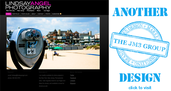
We looked over a collection of Lindsay’s work and quickly realized that her photography skews toward the more creative side, taking pictures of everyday scenes and objects and framing them in a certain way and at the right moment to really make them into pieces of art. Seeing how her images really kind of tell a story, we decided to build the site to be a stylish minimalist backdrop that provides a clean matte that compliments her work and draws the viewers eyes to the work and not some gimmicky graphical elements. This is the reasoning behind our black textured background and minimal use of color.
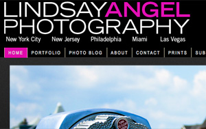
The same idea carried over to the logo/branding. Lindsay did not have a logo, so we had to come up  with something that meshed well with the site and feel we were going for. We chose a stylish and simple sans serif font, played with the thickness and color to break up her name and add a little style, and that was all, no stroke, no gradient, no drop shadow, just a clean, stylish, elegant and understated logo. We also used the logo elements to create a watermark for Lindsay to use on her images.
Some of the interesting design elements:
- Flash. Normally we avoid flash like the plague, it is really a cop-out for a web designer to use and wreaks havoc on usability for the viewer and indexing by google as well as not even showing up on iphones and handhelds. The one case where we make an exception is for model/photographer portfolios, it really makes sense for these sites. While we used some flash for the home page and portfolio, the site is not flash based so a lot of the issues we have with it are minimized.
- Photo Blog. We thought that a great way for Lindsay to share her images would be through a blog. We made it very easy for her to update with new content as frequently as she likes, and we even created a video tutorial for her to use showing how to do the updates to the site.
- Social Network Tools. We coded some icons into the blog allowing viewers to easily share Lindsay’s work through facebook, twitter, digg, stumble upon and other popular social networks. This helps to increase traffic and exposure for the site.
The Next Step
Now that a clean, cohesive, branded site is established as a base, our next step with Lindsay is to consult with her on how to market herself and her site. Having a great home base like her site is imperative before you try to use all of the social networking tools to try and market yourself.
Also, we left a placeholder page for an ecommerce component to sell prints of her work. At some point a custom LindsayAngel.com branded third-party service will be linked there.


